10 Knowledge Base Examples from SaaS and E-Commerce for your Inspiration (2025)

Building a great knowledge base (KB) is a powerful way to help customers self-serve, deflect support tickets, and boost satisfaction.
To me an effective help center should be like those automated menus you come across when you call your telecom or insurance company, for example - the ones where you are presented with a few options to solve an issue by yourself (for payment issues please press 1 ...), sometimes even personalized (if you are calling about your order return, please press 3 ...) but at the same time keeping a live agent just an option away.
In this post, we’ll look at ten public-facing knowledge base examples from both SaaS and e-commerce companies – a mix of well-known brands and some rising startups. For each, we’ll analyze their content quality, design/UX, and support effectiveness. You’ll also get actionable takeaways to apply to your own help center. Let’s dive in!
1. Asana – “Walking the Extra Mile” Learning Hub
About Asana: Asana is a popular project management SaaS. Its public help center is branded as the Asana Guide, focusing on educating users through structured content rather than a typical FAQ setup.
Key Strengths: Asana have walked the extra mile when in comes to providing a unified source of knowledge to their users helping them understand the platform and get the most out of it.
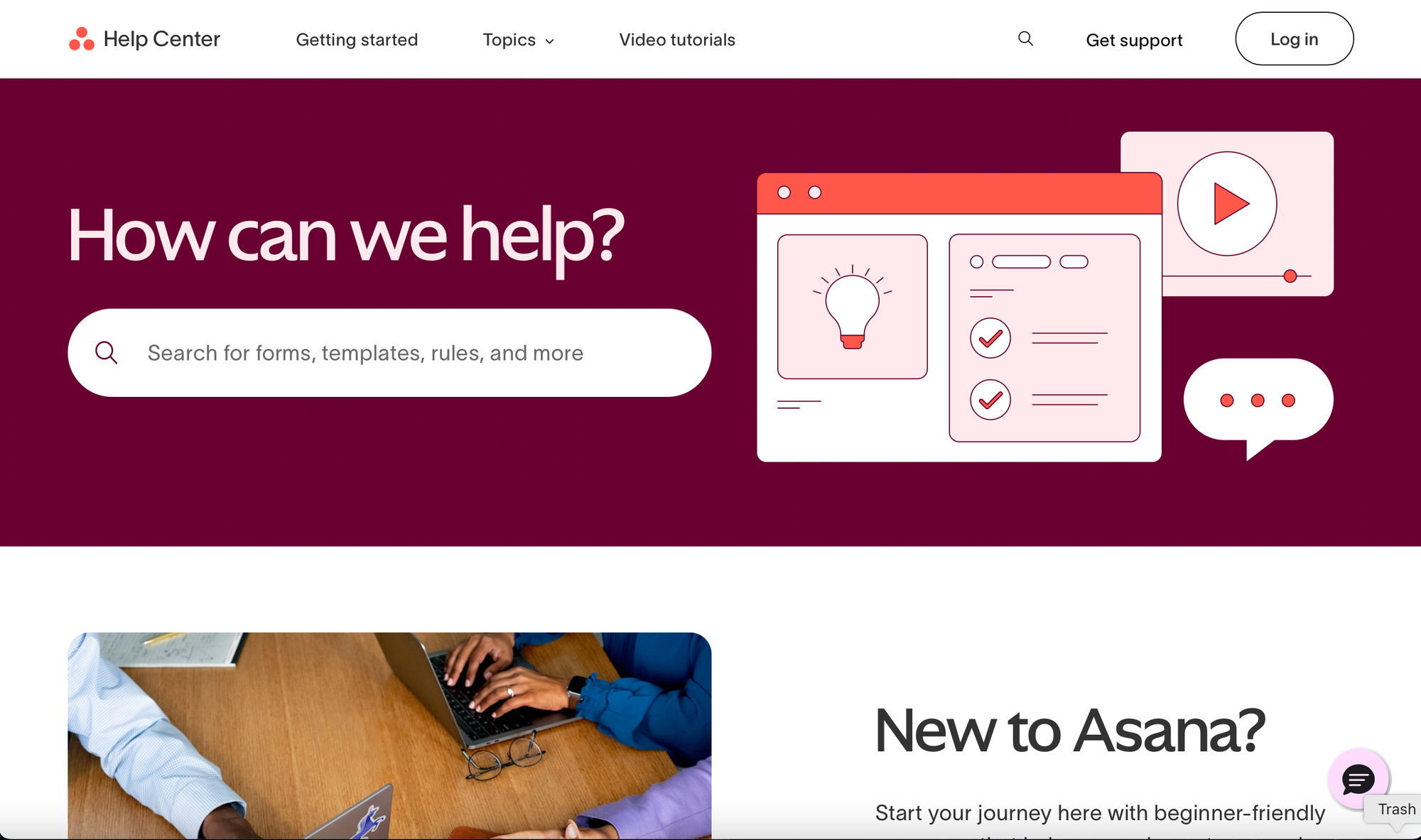
Asana’s Help Center is a prime example of user-first support done right. It welcomes users with a clean, search-first interface and clear pathways for different needs — whether you're a beginner or a power user.
Highlights include:
- A large, friendly search bar with inviting UX
- Dedicated “New to Asana?” onboarding section
- Bite-sized video tutorials under two minutes
- Organized topic cards (like Automation, Billing, Integrations)
- Easy access to community forums, live training, and support
Everything is visually consistent, well-labeled, and designed to reduce friction. If you're looking for inspiration on building a smart, scalable support hub — Asana’s is a must-see.
Takeaways:
- Search-First, Segmented Navigation Enhances UX: Asana leads with a bold, intuitive search bar and follows it up with clearly segmented content blocks (like “Automation and AI” or “Plans and Billing”). This makes it effortless for users to find exactly what they need without digging.
- Short, Actionable Video Tutorials to Drive Engagement: Their “Learn Asana in minutes” section offers ultra-short videos (1–2 minutes) tailored to common tasks. This respects users' time while increasing the likelihood of content consumption and retention.
- Slack - Search-centric support hub with a playful touch
About Slack: Slack is a leading workplace communication platform used by teams worldwide to organize conversations, collaborate in real-time, and integrate workflows with other tools. Its popularity spans startups to enterprise giants.
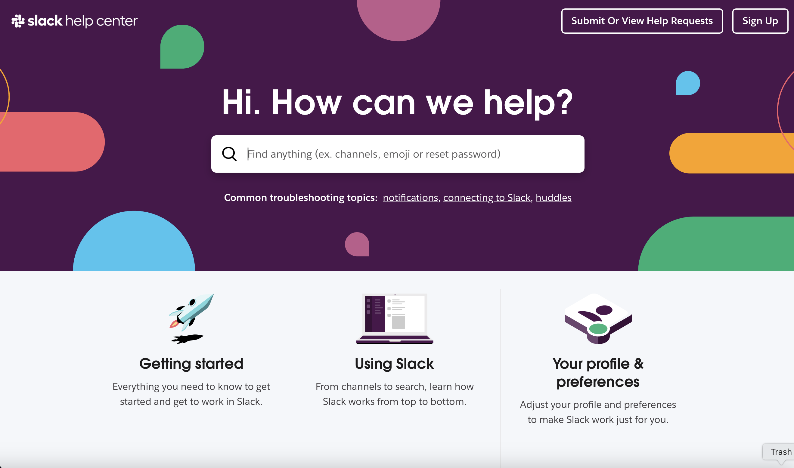
Key Strengths: Slack’s Help Center, located at slack.com/help (not a subdomain), is a vibrant, well-organized portal that mirrors the brand's playful yet professional tone. The homepage combines a powerful search bar with immediate access to key content areas like getting started, using features, and customizing preferences.
The UI is clean and colorful, enhanced by custom illustrations that make the experience friendly and engaging. Featured articles, quick tips, and shortcut advice are presented in digestible chunks that respect users’ time while delivering high value.
Notably, the help center lives on a subdirectory, which may be an intentional move to boost the SEO strength of the primary domain (slack.com). This structure helps concentrate traffic, page authority, and indexing power — especially important for a high-traffic SaaS platform.
Takeaways:
- Subdirectory vs. Subdomain: Hosting the Help Center at
slack.com/help(instead ofhelp.slack.com) strengthens the overall domain authority and improves the visibility of help content in organic search — a savvy SEO decision for mature SaaS brands. - Design That Reflects the Product: The help center feels like an extension of the Slack app — approachable, intuitive, and full of small, delightful touches (like keyboard tips at the bottom).
- Topic-Based Navigation: The homepage focuses on role- or task-specific categories — getting started, automation, admin tools — making it easier for users to find what matters most to them.
- Twilio - An AI-first approach to self-service
If you are one of those businesses that are going all-in head-first on AI, you are going to like what Twilio have done with their help center but first, let's see who Twilio are if you haven't heard of them, yet.
About Twilio: Twilio is a cloud communications platform that enables developers to programmatically make and receive phone calls, send text messages, and integrate voice, video, and messaging into their apps. It powers communications for companies like Uber, Airbnb, and Stripe.
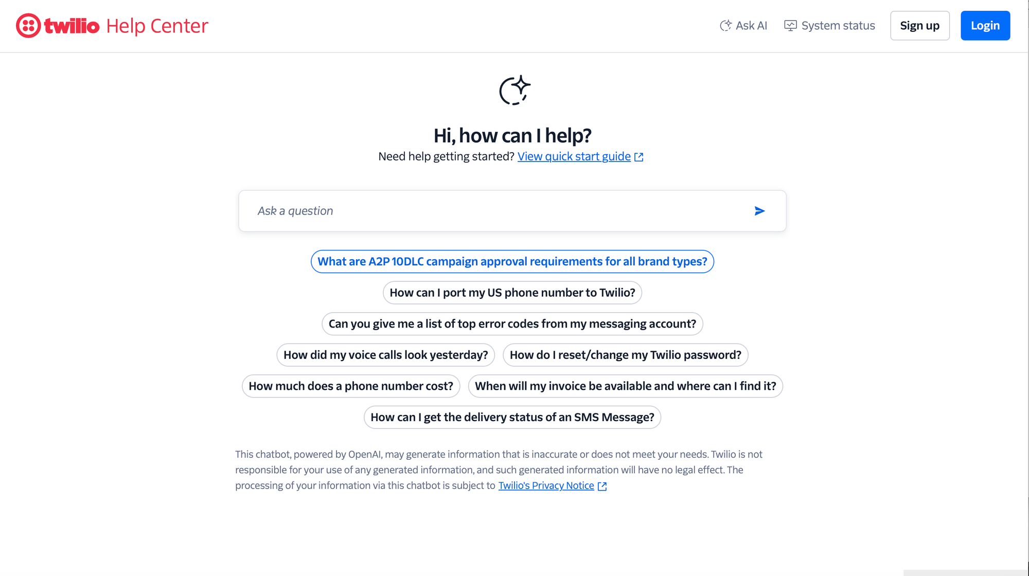
Key Strengths: Twilio’s Help Center takes a conversational, AI-first approach to support. Instead of traditional categories or lists of articles, users are encouraged to ask questions directly. The landing page prominently features a smart search box backed by AI — powered by OpenAI — which suggests common queries like “How can I port my US number?” or “How do I reset my Twilio password?”
This setup makes support feel personal, fast, and highly contextual. It’s also more accessible for technical users who are likely used to command-line or query-style interactions. By skipping the browsing and offering quick, direct answers or linking to specific docs, Twilio streamlines support for a developer-heavy audience.
Takeaways:
- AI as the Front Door: Putting AI-driven search at the center of the help experience improves accessibility, speeds up issue resolution, and mimics a live chat-like experience without the overhead.
- Tailored for Technical Users: Twilio understands its core audience — developers — and offers a no-fluff, just-ask approach that prioritizes efficiency over design-heavy browsing.
- Payhawk - Basic but Well-Structured
About Payhawk: Payhawk is a global spend management platform that combines company cards, expenses, bill payments, and accounting automation into a single solution. It's used by finance teams to control company spending across multiple entities.
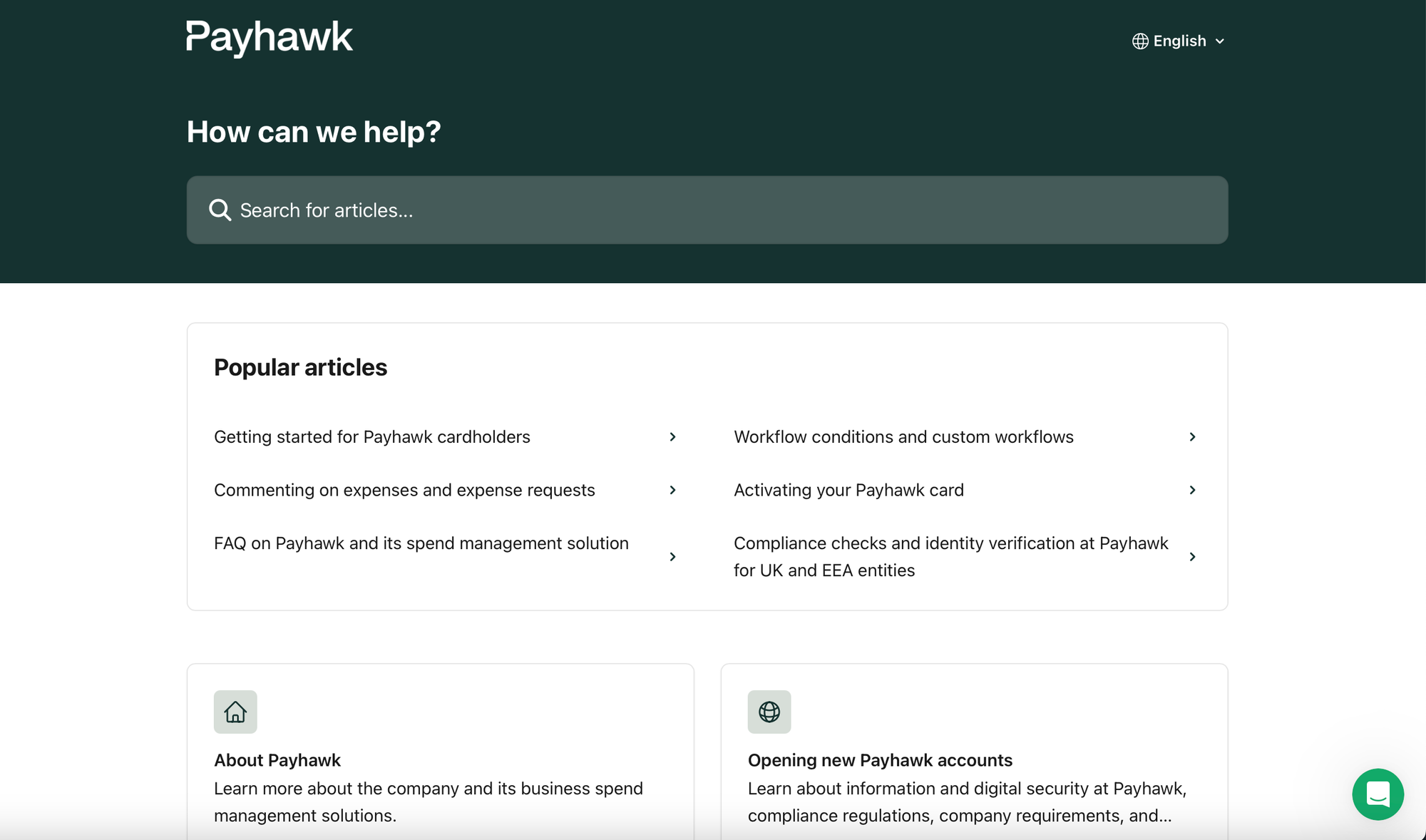
Key Strengths: Payhawk’s Help Center may not dazzle with high-end design or animations, but it delivers where it truly matters: clarity, structure, and relevance.
The homepage prioritizes user intent with a simple search bar and a list of popular articles right at the top — perfect for surfacing common tasks like activating cards or understanding workflows. Below that, content is organized by user role (employees, administrators, accountants, developers), which is a smart way to reduce cognitive load and increase content relevance.
The structure is clearly maintained, with dedicated spaces for product updates (“What’s new”), experimental features (“Payhawk Labs”), and troubleshooting.
This is a textbook example of a minimalist, low-friction knowledge base that’s clearly built for function over flair. And that’s a good thing.
Takeaways:
- Good content structure > flashy UI: A help center doesn’t need to win design awards. Keeping it updated, searchable, and tailored to user roles is far more valuable.
- Maintenance is everything: Even with a simple template, frequent content updates and structural adjustments (based on customer feedback and product evolution) ensure users find value every time they visit.
- Popular topics front and center: Highlighting frequently accessed articles helps reduce ticket volume and guide users to quick wins.
- Mailchimp - A Comprehensive Help Center Experience
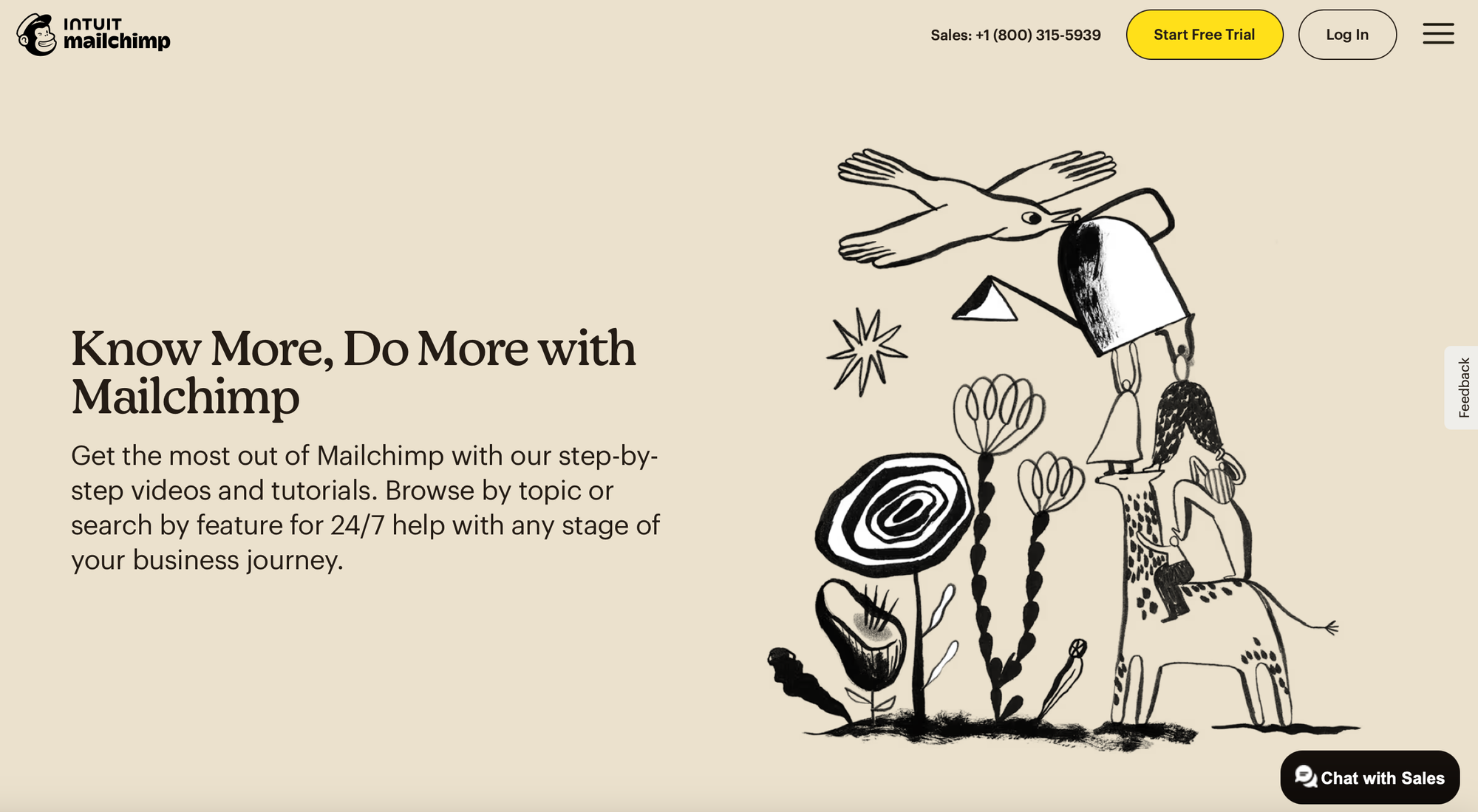
About Mailchimp: Mailchimp is a popular email marketing platform used by small businesses and entrepreneurs to run campaigns, automate marketing workflows, and grow their audience. Now part of Intuit, it has expanded into a broader customer engagement suite.
Key Strengths: Mailchimp’s Help Center stands out for its brand-first design, beautifully reflecting the playful, artistic identity the company is known for. From illustrations to typography, every detail is unmistakably “Mailchimp.”
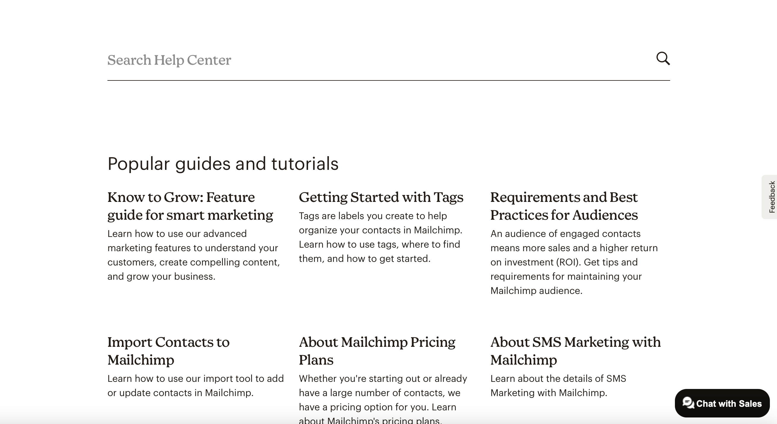
Interestingly, the search bar — typically the hero of most help centers — is visually subdued and placed further down the page, below the main header. While this might slightly affect discoverability, the site compensates with strong visual and content guidance: popular tutorials, help by topic, video series, expert directory access, and support options are all clearly laid out in a structured, scrollable flow.
The use of videos, step-by-step guides, and segmented categories like “Email Delivery,” “Merge Tags,” and “Integrations” show a deep understanding of the typical Mailchimp user’s needs at various experience levels.
Takeaways:
- Branding matters: Mailchimp proves that your help center can (and should) reflect your product personality. It makes support feel like a seamless extension of the product experience.
- Content-rich wins: Even if the search UI is less prominent, a well-structured layout with diverse content types — guides, videos, contact options, expert help — ensures users can still find their way.
- Hierarchy is flexible — if guided well: While the search isn’t front and center, the Help Center’s scrollable journey compensates by gradually offering value through curated entry points.
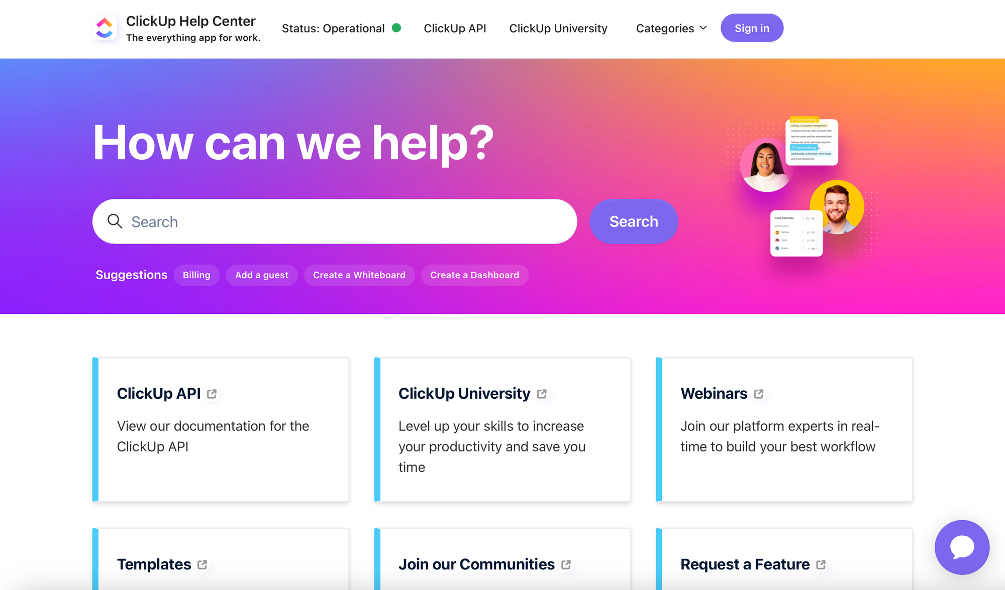
- ClickUp - The self-service as an extension to the product
About ClickUp: ClickUp is an all-in-one productivity platform for tasks, docs, goals, time tracking, and team collaboration. It aims to replace multiple tools like Trello, Notion, and Asana by centralizing workflows for individuals and teams.
Key Strengths: ClickUp’s Help Center is bold, modern, and packed with value right from the jump. The large search bar sits inside a visually striking gradient hero header, supported by suggested quick links like “Billing” or “Create a Whiteboard.” This encourages action immediately.
What sets this help center apart is how it ties in product education with community. Direct access to ClickUp University, webinars, and API documentation makes it clear they want to help users grow — not just troubleshoot. The categorization is thoughtful, addressing onboarding, setup, features, views, integrations, and more.
There's a very proactive tone throughout: guiding users to request features, join communities, and explore templates. And the “Most viewed articles” section at the bottom works as a smart catch-all for common support needs.
Takeaways:
- Education-first mindset pays off: Resources like ClickUp University, webinars, and documentation links show strong investment in helping users grow with the product — not just solve issues.
- Beautiful meets functional: The design is engaging without sacrificing usability. The search bar placement, though visually forward, doesn’t compete with navigational clarity.
- Customer connection goes beyond articles: Highlighting feature requests and communities makes users feel involved, not just supported.
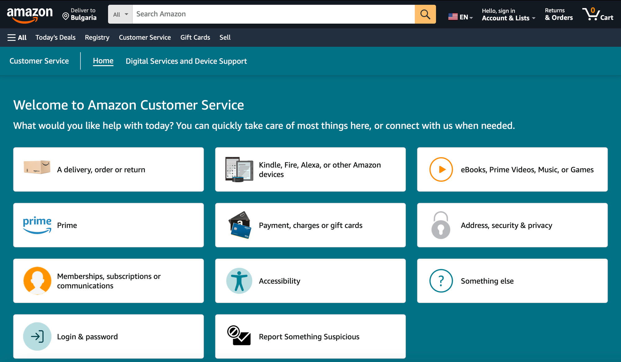
- Amazon: Large-scale customer self-service
Yup, you are most probably already well-aware with who Amazon is. However, let's stick to the usual structure and start with the already-familiar quick intro about the business.
About Amazon: Amazon is one of the world’s largest e-commerce and cloud computing companies, offering everything from groceries and gadgets to streaming services and enterprise solutions. With millions of daily customers and a global footprint, it has a massive responsibility to deliver seamless, scalable support.
Key Strengths: Amazon’s help center is built for scale and speed. What stands out immediately is the personalized experience: once you're signed in, the dashboard dynamically adjusts to show the most relevant help options tailored to your account activity. From returns to payment methods, everything is pre-sorted so users can resolve common issues within seconds.
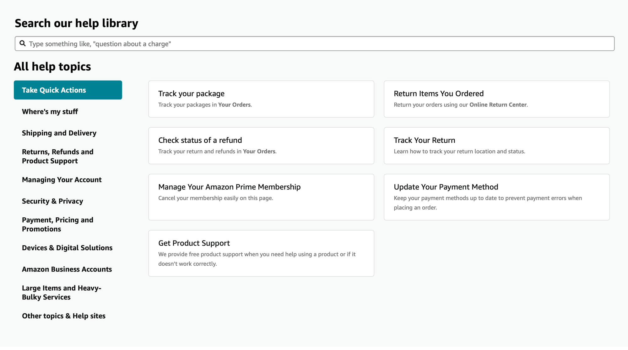
The layout is practical and intuitive — large, icon-based tiles guide users to categories like "Your Orders," "Prime," or "Login & Password" with zero ambiguity. Clicking into these leads to structured, concise articles that often include visual guidance like screenshots of account pages or order histories. There’s also seamless escalation: if the article doesn’t solve your problem, chat, email, or phone support is just a click away — no need to hunt for contact details.
Takeaways:
- Account-aware assistance: By requiring sign-in before accessing help topics, Amazon tailors the support experience to each customer’s actual purchases and preferences.
- Designed for deflection: The system anticipates the most common issues and proactively routes users to the solution before they even reach out.
- Multi-channel resolution paths: Each article is both self-service and support-assisted, depending on whether the issue was resolved or needs escalation.
- Instacart - Personalization and guidance at every step
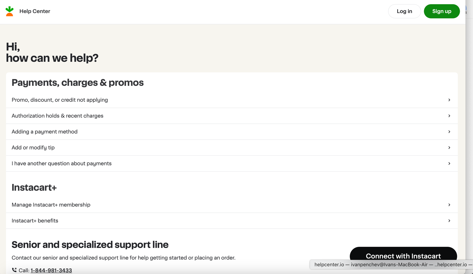
About Instacart: Instacart is a leading grocery delivery and pick-up service operating across the U.S. and Canada. It connects customers with personal shoppers who handpick items from local stores and deliver them on the same day.
Key Strengths: Instacart’s help center takes a slightly different approach compared to the typical search-first design. Instead of leading with a search bar, the homepage focuses on directing users to personalized support pathways. However, it is similar to what Amazon are doing and in-fact that's very common approach to tackling self-service with large e-commerce businesses. This includes options like recent payment issues, membership questions, and direct access to a dedicated support line — especially useful for senior customers.
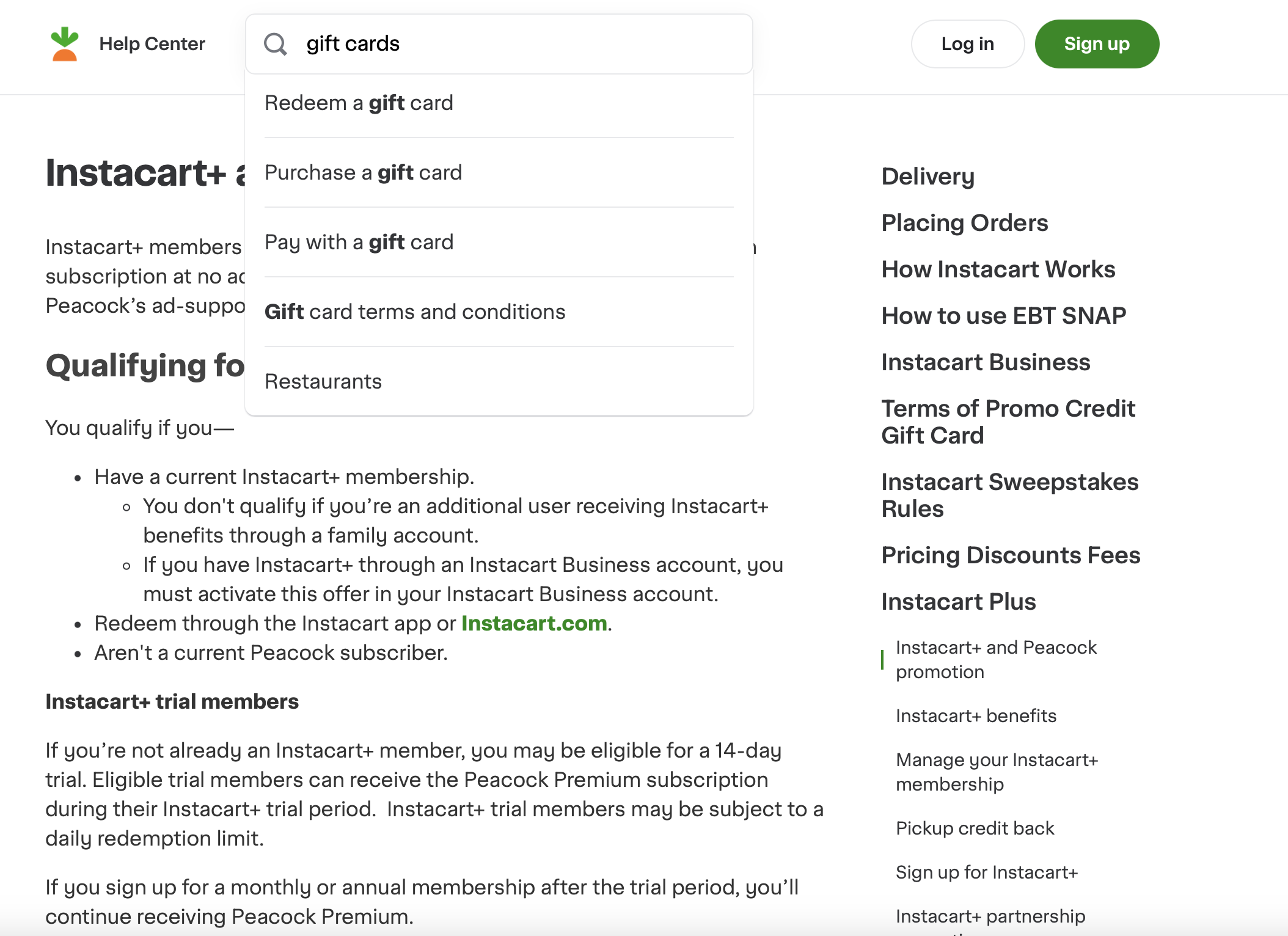
Once inside an article, an instant-search feature appears, offering helpful, as-you-type suggestions. Their content is clean and task-based, and it becomes even more relevant when the user logs in.
The help center of Instacart also goes on a path-level (instacart.com/help) instead of going with the usual subdomain-based approach. Probably to keep experience consistent with their main product.
Takeaways:
- Instacart centers the help experience around signed-in users, prompting login early to deliver more tailored support.
- Instead of offering a flashy UI, the layout prioritizes clarity: actionable categories, straightforward language, and clear phone support info.
- The dynamic search that activates inside articles is a nice touch — it reduces homepage clutter while still offering robust ways to look for more content when needed.
- Repeated prompts to log in or contact support strike a strong balance between self-service and assisted help.
- ASOS - Straightforward but Well-Organized
About ASOS: ASOS is a leading UK-based online fashion and cosmetic retailer catering to a global audience with a strong millennial and Gen Z customer base. With a high volume of daily orders and returns, a reliable and accessible help center is critical for their customer experience — and their self-service support is clearly designed to handle these needs at scale.
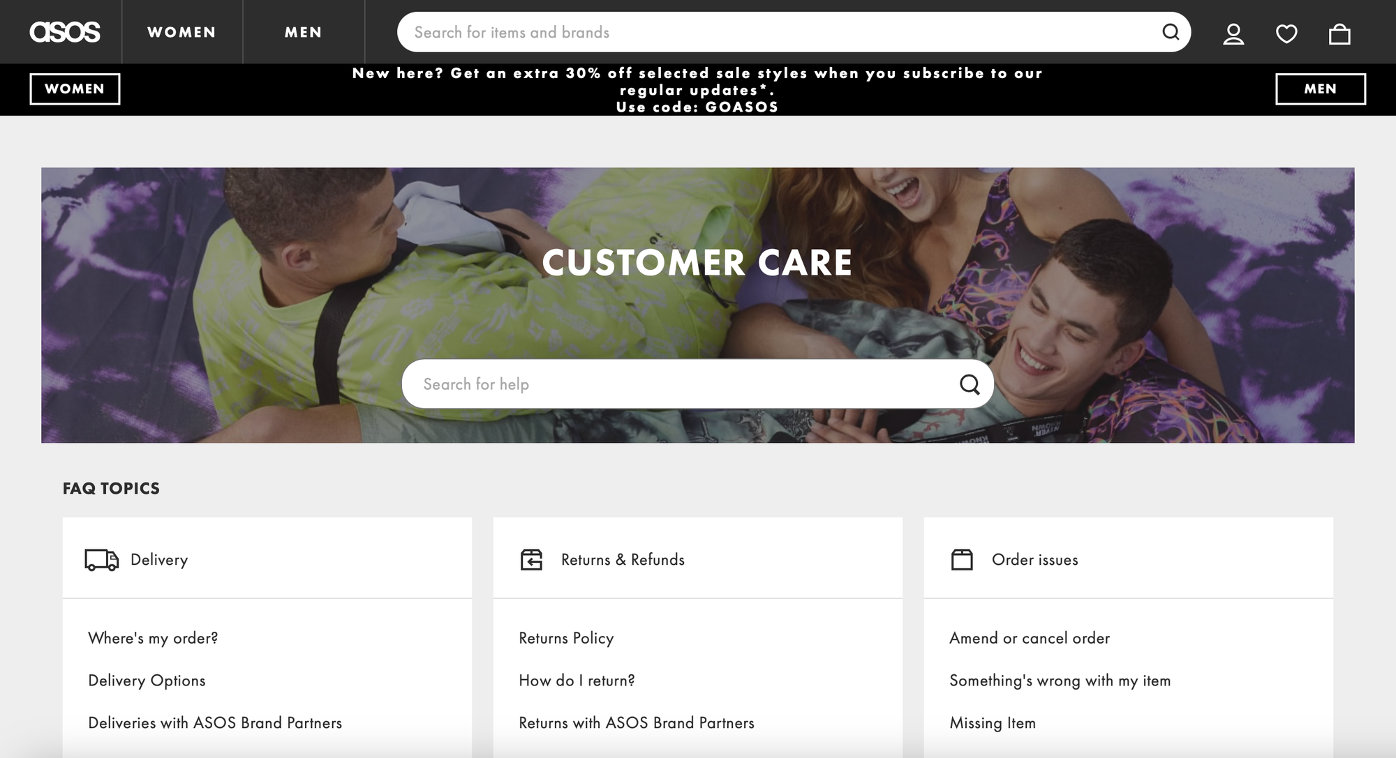
Key Strengths: At first glance, ASOS’s help center feels quite straightforward — not overly designed, not trying too hard to impress — and that actually works in its favor. The hero section features a large background image and a central search bar with a clear “Customer Care” label. It’s all very on-brand and friendly, but when it comes to functionality, things get a bit more traditional.
Unlike more advanced help centers that rely on smart search and personalization, ASOS puts its navigation-first approach front and center. Everything is categorized into well-defined sections — Delivery, Returns & Refunds, Order Issues, Product & Stock, Payment & Vouchers, and Technical. Each one contains bite-sized FAQs grouped logically under clear headings. This structure keeps things easy to follow, even if the design isn’t particularly modern.
One thing that stands out is that search takes a backseat. It’s visible on the homepage, but it’s a static input with no autosuggestions or real-time results. Once you move away from the homepage, the search box is relocated into the sidebar — a noticeable difference from other help centers where the search is persistent or becomes more intelligent as you type. It’s a bit of a missed opportunity considering the amount of content available.
That said, ASOS does a great job with content structure. Articles are short, direct, and conversational. They cover the core issues — “Where’s my order?”, “How do I return something?”, “What is your returns policy?” — and provide clear instructions or links where needed. Each article is also surrounded with helpful elements like related FAQs and an a
Takeaways:
- Category-first layout that works: Instead of relying on advanced search or personalization, ASOS has chosen to organize everything around clearly defined categories like Delivery, Returns & Refunds, Order Issues, and Payment & Vouchers. These are intuitive, easy to browse, and cover the full range of customer needs without requiring account access.
- Straightforward FAQs: The help content is simple, conversational, and directly answers common questions. FAQs are written in a customer-friendly tone and are often paired with related articles, making it easier to go from one relevant topic to another.
- eBay - Effective Self-Service with Built-In Feedback Loops
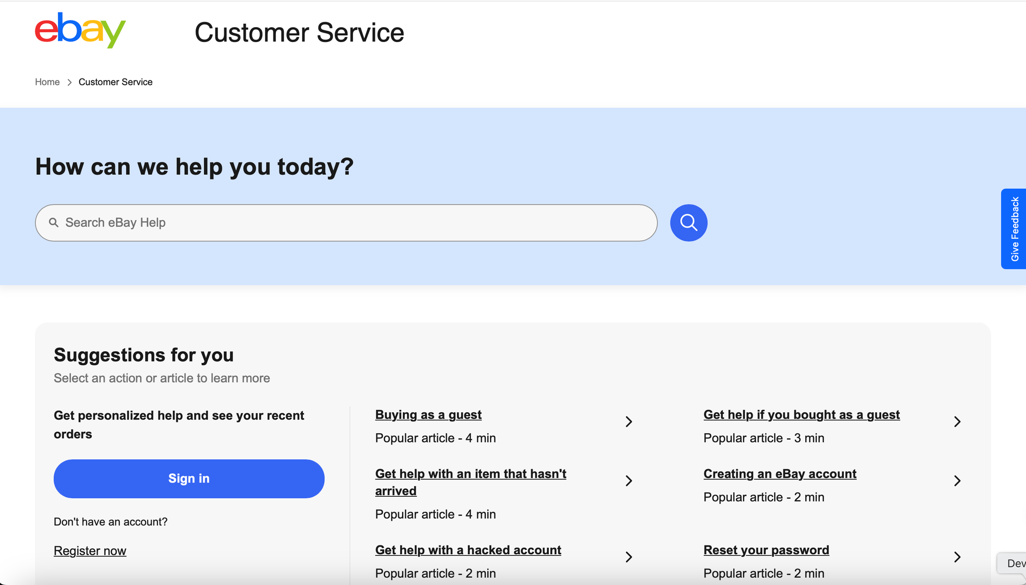
eBay is also one of those businesses that don't really need a presentation but still, to keep the usual format, there it goes and we dive straight into checking their key strengths and what are some things we could take for our help centers.
About eBay: eBay is one of the world’s largest online marketplaces, enabling millions of people to buy and sell across practically every category. With such a broad user base and a mix of buyer and seller interactions, customer service needs to cater to both casual shoppers and power sellers alike.
Key Strengths: eBay’s help center is built around efficient self-service and offers a clean, streamlined design that reflects the brand’s functionality-first mindset. Right from the homepage, the large and simple search bar stands out against a calming blue background, inviting users to jump straight into problem-solving.
Personalization is a strong theme here—users are encouraged to sign in to unlock relevant suggestions and see recent activity. This context-awareness makes for a more efficient support journey, especially for issues like returns, refunds, and account access.
Help content is broken down into intuitive, icon-based categories (Buying, Selling, Account, Shipping and Tracking, etc.) making it easy for both buyers and sellers to quickly find their way around. Additionally, quick links to common actions—like starting a return or reporting a missing item—are smartly positioned at the bottom of the page for rapid resolution.
What sets eBay apart is their consistent emphasis on feedback. There’s a persistent "Give Feedback" tab and a built-in survey pop-up that asks users to rate the helpfulness of the help center experience. This active listening loop signals a culture of continuous improvement and user involvement.
Live support options are available too, with a clearly marked "Contact us" section allowing users to reach a chatbot or agent if needed, striking a solid balance between automation and human touch.
Takeaways:
- The help center design is minimal but functional, prioritizing clarity, search, and user context.
- Their proactive feedback mechanism is a standout feature, turning users into contributors to continuous service improvement.
These ten examples show there’s no one-size-fits-all approach to a successful knowledge base. You can innovate with unique structures (like ClickUp’s learning paths or Twilio's AI-first approach) or stick to tried-and-true layouts – what matters is how well it serves your users’ needs. Key themes include a strong search experience, intuitive content organization, personalization, engaging formats (videos, images, etc.), and an easy path to further support if needed.
Use these real-world inspirations as a benchmark. Does your help center quickly solve common issues? Is it easy to navigate? Does it reflect your brand’s voice and values? By borrowing ideas from the SaaS and e-commerce leaders above, you can elevate your own knowledge base into an even more effective self-service resource.
Start by applying one or two takeaways – over time, you’ll build a help center that not only deflects tickets but also delights and empowers your customers.